What is the "design system" that improves brand image and consistent design? Explanation based on examples!

The design system is a collection of guidelines and components to make the user interface of products and services consistent.
This allows designers and developers to work more quickly and efficiently, and as a result, provide consistent experiences to users.
In this article, we will introduce the concepts and examples of the design system!
What is a design system?
The design system is a collection of guidelines and components to ensure the consistency and efficiency of design in product development. This system usually contains the following elements:
-
UI component
- Reused user interface elements, buttons, text fields, navigation bars, etc. These are created based on design and coding guidelines to keep them consistent.
-
Design principle
- Basic principles and philosophy that guide design decisions. This includes user experience consideration, accessibility standards, and responsive design approaches.
-
Style guide
- A guideline that defines visual elements such as colors, fonts, intervals, and icons. This will maintain the consistency of the brand.
-
Pattern library
- Collection of design patterns that are often used. This includes a design solution that is ideal for specific user interaction and workflow.
-
Documentation and guidelines
- A detailed document that explains how to use the design system, how to use components, how to apply the design principle.
-
Chord reset
- A repository for storing reusable code, components, and templates. As a result, developers can easily use existing assets and promptly develop their development while maintaining consistency.
- A repository for storing reusable code, components, and templates. As a result, developers can easily use existing assets and promptly develop their development while maintaining consistency.
The design system aims to enable designers and developers to have a common standard for providing consistent user experiences, and to improve the speed and quality of product development. It also has the role of new team members and external collaborators so that they can easily participate in projects.
3 examples of design systems
POLARIS (SHOPIFY)

Shopify also has a design system.
Polaris is often used for buttons and navigation used on the app management screen.
Developed by our companyGO SUB | Subscription | SubscriptionIt is also implemented using Polaris!
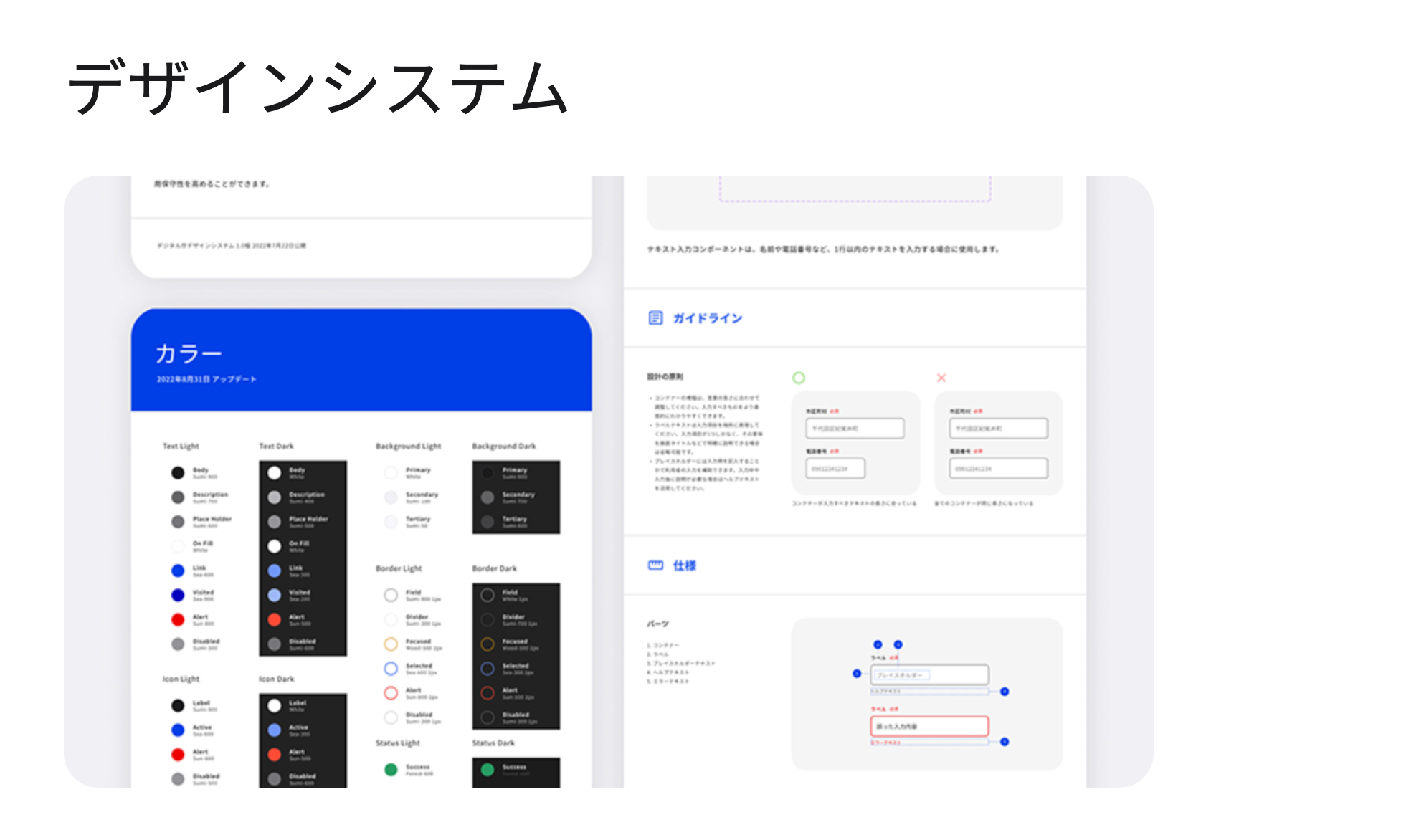
Digital Agency Design System

A design system built by the Japanese Digital Agency.
Anyone can view it, and the figma data is also available.
SMBC Design System

SMBC design system that won the Good Design Award for 2021. This is an unusual case of adopting a design system at a major financial institution.
summary
From the outline of the design system, we introduced it with examples.
A very effective design system for major companies to unify design and consistent user experience.
It can be said to be an important strategy to improve the productivity of the team and ensure output quality, no matter who enters the team at any time.
The following articles are also recommended!
-
Effective for improving CVR! I will explain the points of UI/UX that should be aware of in the production of EC sites, including examples.
-
Seriously selected in 2023! 5 SHOPIFY themes that I would like to recommend that focus on design and functionality
- You can do it with KLAVIYO! How to create a creative e -mail magazine design?


