The long -awaited Japanese compatible 🇯🇵 Designer must read! What is Apple Human Interface Guidelines?

What is Human Interface Guidelines?
Human Interface Guidelines (Hig) is design rules and recommendations for creating user -friendly UIs with Apple products (iPhone, iPad, Mac, etc.). The visual design of software and hardware and user experience are summarized. The purpose of Human Interface Guidelines is to ensure consistency and quality between Apple products so that users can understand and use.
It is a must -read content not only for designers but also for engineers.It has been updated from the first edition of 1978 to the present.
Update
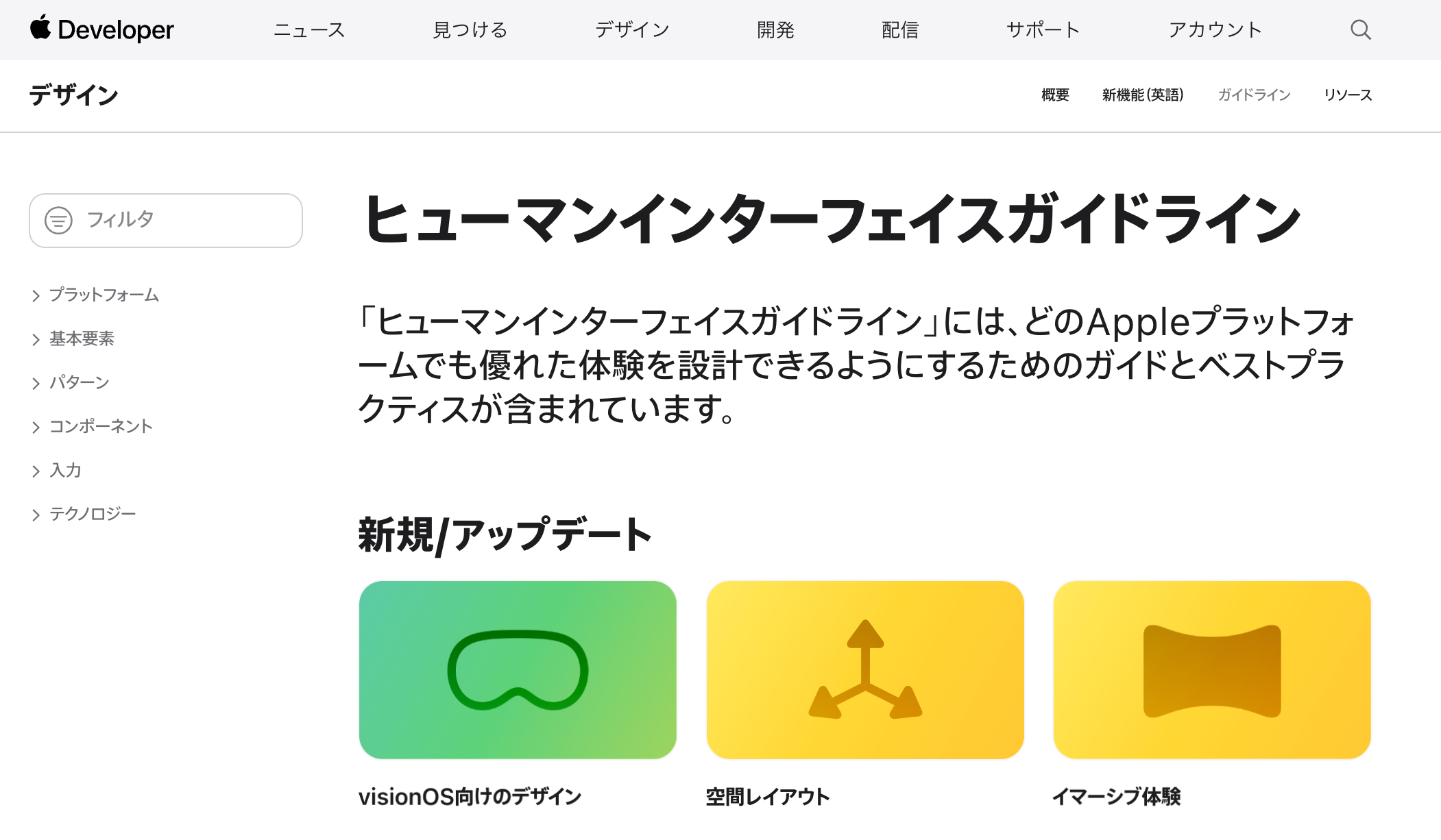
Until now, it was provided only in English,Japanese versionHas appeared!
It is a very nice update.

Foundations

The basic principles based on the user interface design are shown. These principles recommend to focus on visibility, consistency, and operability. It describes the use of easy -to -use text, the arrangement of appropriate user interface elements, and providing intuitive operability.
Platforms

A guideline for designing user interfaces for various platforms. iOS, iPados, MacOS, TVOS (Apple TV), Watchos (Apple Watch), etc. are a guideline for creating an interface that is unique to UI elements, controls, patterns, intuitive and easy to use, and visual interfaces. It describes the creation of an interface that provides a consistent and consistent user experience on a specific platform by following the guidelines.
Patterns

Design patterns for creating general user interface elements and interaction. The design pattern is a solution to the design problem, and is a guideline for designers to create consistent and easy -to -use interfaces. Includes general interface elements such as navigation bars, tabs, buttons, tables, and interactions such as scrolling, swipe, and taps. Providing guidelines for elements and interaction designs and movements, making it easier to use between platforms between platforms. By following the guidelines, you can create an intuitive and familiar interface.
Components

It describes general UI elements (tabs, navigation bars, text fields, etc.) defined in Human Interface Guidelines. This section describes how these UI elements are used, providing consistent, consistent experiences, and designed.
INPUTS

The guidelines for users to enter information in the application are listed. This section includes designation for UI elements such as text fields, picklists, data pickers, and switches. By following this guideline, you can create a consistent and intuitive UI for applications.
Technologies

Guidelines on technology related to the Apple platform are listed。 This section includes designation related to technology such as touch -based interaction and dynamic type. The application can be designed to work accurately according to the expected value of Apple user experience.
lastly
I introduced some of them, butHuman Interface Guidelines has many categories and is always updated.
The design trends change with the times, but I think that it is a very useful material that can be used to hold down the trend and know about the ideas of the design.
We are SHOPIFY official Shopify Plus Partner, which has only 14 companies in Japan. Not only design, but also one -stop support for EC sites.
Please feel free to contact us from the inquiry page below.
Contact Us


